Add tooltips functionality to radio button, checkbox answer choices
Magic Tooltips For Gravity Forms supports tooltip functionality for radio button, checkbox answer choices, and Likert Scale Survey field for the Gravity Forms Quiz Add-On.
By default, when you add tooltips for radio button group fields, checkbox fields, and Likert Scale Survey fields, tooltips only show when the mouse hovers over the field label (field title). But in some cases, you might want to add tooltips for each choice of a radio button group or a checkbox group, or a Likert Scale Survey field for the Gravity Forms Quiz Add-On.
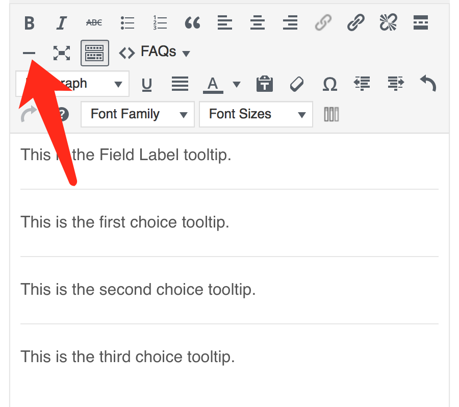
To make things simple, you can use the horizontal line in the visual editor to divide tooltip content for each choice. The content before the first horizontal line is for the field label (field title), and the content right after each horizontal line is for the answer choices.
If you don’t want to display a tooltip for the main checkbox label, you should have within your content tooltip a <hr> tag start, and no text above this HR.
To display the checkbox tooltips, you must first uncheck the following in the plugin settings: “Hide description and show field label as tooltip.”